The future of icons
Once came across an entertaining post on the future of logos. The authors tried to look into the future and imagine how will look famous brands in a few years.
Inspired by the post, I thought it would be fun to make our own evolution icons. Options for the future of our world is a fiction invented by a huge number and it is likely that they someday, somehow will come true.
I just had to take a few picturesque scenarios, to place history and make the visualization.
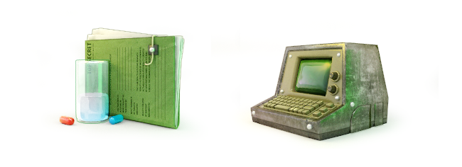
Originally, I had Napoleonic plans: to take the most characteristic icons of OS and you could say five hundred years ahead. Along the way, I realized that the first bunch of icons in the course of time just disappear, and some just will not find counterparts in all fantastic versions of reality, and second icons then get quite a lot and given free time to create them will take about a year. Took four pieces, seemed the most promising and away we go:
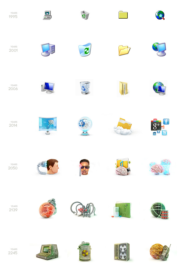
Appendage
Usually initially make the icons larger than required, then reduce and finished. First, it turns out a higher quality end result, second is the end of the work there is a need to make an icon more or even turn into a mini illustration.
In this case, the source of love for the art)) were made a little too large.
Projection screen. "It was an explosion of swamp gas"
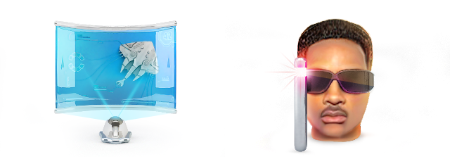
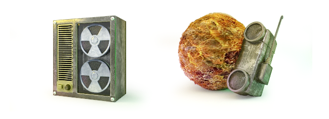
"The Matrix has you..."
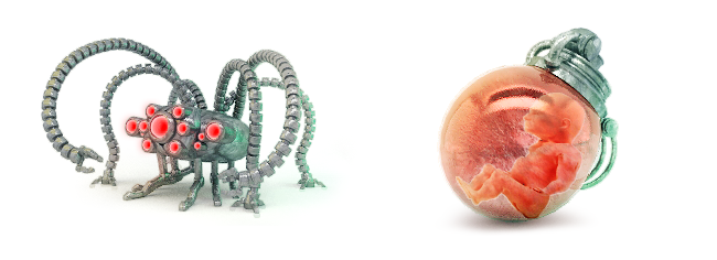
"Follow the White Rabbit". "War. War Never Changes"
"Welcome to the workplace of the operator of the packaging line Nuka Cola"
PS Looked at the last posts in iconostase and couldn't resist — drew his version of the icons of popular services. I believe that the designers of a lot of undeserved attention from the squares (rounded or not), and forget that there are other beautiful shapes, such as irregular hexagons. Increase the number of angles that will improve the geometric, long live diversity)))
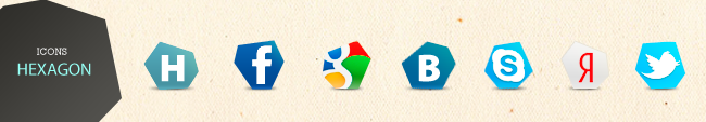
P. P. S. At the request of those wishing to spread hexagonal icons
the Archive .PSD and .PNG
In General, quite frankly, it was the banter)) I find it funny that people are so hung up on these long-suffering icons, so I wanted to show that there are a variety of shapes, gradients and shadow:)
Corrected the problem with the Dating of icons, adding another step with XP


Комментарии
Отправить комментарий